Casa Blanca's Central American Bakery
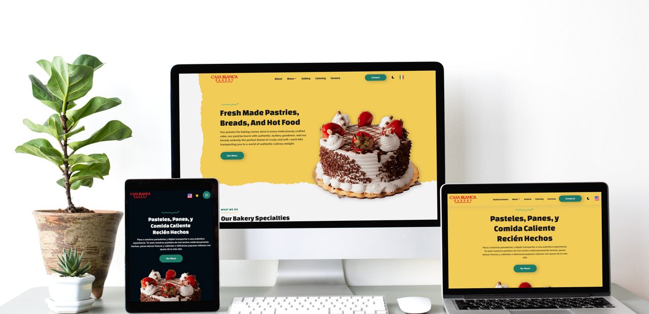
Some projects need a little "more". Like Casa Blanca - A Central American bakery located just outside Washington D.C. that wanted to stay true to it's heritage with a dual-nationality site.
A joint project with our beloved partner Oak Harbour Web Designs, we were tasked with implementing internationalisation for Casa Blanca's website, enabling translations in both English and Spanish. Additionally, the frequently-changing menu required a level of control for the client, necessitating our implementation of a Content Management System.
Visit the WebsiteCreative Design, With Bleeding-Edge Technology
Internationalisation
With Spanish-speaking owners and Central American roots, Casa Blanca needed a language-change feature for their website. Traditional methods often use scripts that can slow down the site and affect user experience. However, using the translated text provided by the client, we implemented a language toggle that avoided these issues, staying true to our Pagespeed Guarantee.
Client-Managed Menu
One similarity between Oak Harbor Web Designs and Test Valley Digital is our "unlimited edits" approach to web design. However, some cases require the client to have control over specific aspects of the website. To address this, we implemented an intuitive content management system, allowing the client to manage the menu independently while still collaborating with us for changes beyond the menu.
Exciting Design
The Central American theme extended beyond the mere text on the page and into the design. Loud colours and fun graphics made for a very interesting design, sure to increase Time on Page and reduce Bounce Rate metrics.

Pushing Websites to the Limit
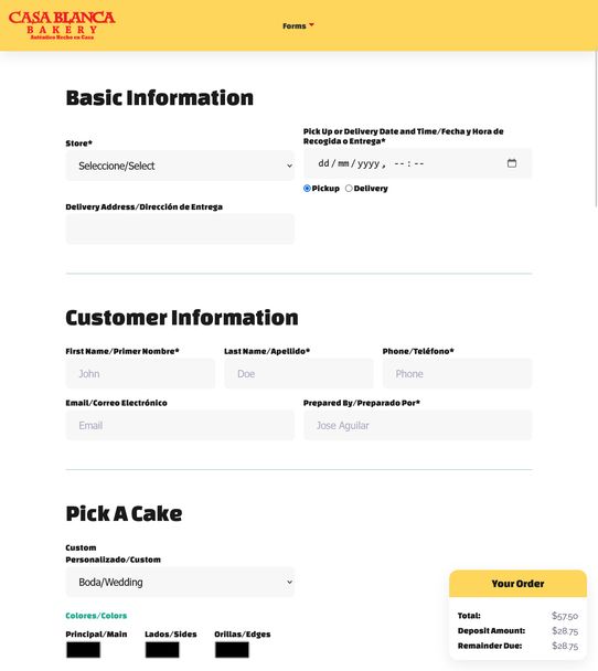
The client's substantial budget enabled us to allocate extra resources to the website. Not only did we implement dual-language functionality and a bespoke content management system, but an additional backend development partner was brought on to create a cake-ordering system.
This resulted in a product that bridged the gap between a "website" and an "application". Like Casa Blanca's cakes, the ordering system was tailor-made for the bakery, fitting perfectly within their workflow, boosting efficiency, and improving customer satisfaction.


